YiweiWang_dataviz_portfolio
Critique - Valentine’s Day Candy Map
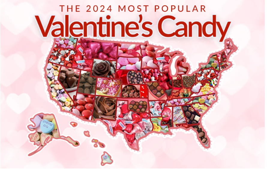
For this graphic, what do you see first?
When I first look at this graphic, the pink and red colors stand out the most and give me an instant Valentine’s Day feeling. My eyes are also drawn to the big title “Valentine’s Candy,” which is so large that it feels stronger than the actual map itself. After that, I notice that each state is filled with candy pictures, but there are no numbers showing in this map.
Make a note of the first idea that forms in your mind and then search for more.
The first idea that comes to mind is that this graphic is festive and fun, which matches the Valentine’s vibe, but it does not communicate much information clearly. As I spend more time looking, I realize it is supposed to show the most popular Valentine’s candy in each state. However, the candy pictures are crowded and there are no labels, so it is hard to tell which state has which candy without guessing. I also notice there is no explanation of what “most popular” means—whether it is sales, surveys, or something else. This makes me question how reliable the data is. Overall, the graphic looks attractive, but as a data visualization it feels more decorative than informative.
Recommendation
- I would change the candy photos into a cleaner system that groups candies into broad categories such as chocolate hearts, boxed chocolates, gummies, or hard candies, and then assigning each category one clear and consistent color because this adjustment follows the heuristic principle of reducing clutter and improving clarity. By using color, viewers could quickly scan the map and recognize patterns across states without being distracted by detailed images. It would also lower the cognitive load, since the audience would not need to guess what each picture represents.
- I would change the title to “Most Popular Valentine’s Candy by State Based on Sales” and also include a short annotation about how the data was collected. Because the original title didn’t explain what “most popular” meant, which made the results feel less reliable. A clear title provides essential context before viewers even look at the map, and adding a small footnote on methodology would further improve credibility.
- I would add the actual sales numbers for each state directly on the map because knowing the quantity gives viewers a better sense of scale. Right now the map only shows the winning candy in each state but not how popular it actually is. Showing numbers makes the information more concrete and credible, and it allows people to see the large differences in popularity between states.
Good Chart Matrix
I ranked the Valentine’s candy map around -4 on design execution and +3 on contextual awareness. From a design perspective, the execution is very weak. I think the collage of candy images makes the map cluttered and difficult to read(which copilot missed), there are no labels or clear legend, and the chart never defines what “most popular” means or shows the actual sales data. These issues align with my earlier critique that the visualization fails to present the data clearly. On contextual awareness, I scored it slightly higher but still low overall. The Valentine’s theme is obvious through the pink and red colors, candy imagery, and holiday connection, and the map does communicate its basic purpose of showing which candy is most popular in each state to people who want to buy candy on Valentine’s day. However, as I noted in my critique, the missing explanation of criteria and data source weakens credibility. For that reason, I can only give it around 1–2 points on contextual awareness.