YiweiWang_dataviz_portfolio
| home page | data viz examples | critique by design | final project I | final project II | final project III |
Outline
For my final project, I want to explore how art collections change over time and what that says about representation in the art world. I’m especially interested in who gets collected (for example, differences between male and female artists) and how those patterns have shifted in recent decades. Museums and collections play a big role in shaping cultural memory, so it’s worth asking whether they are becoming more inclusive or still reflecting older imbalances.
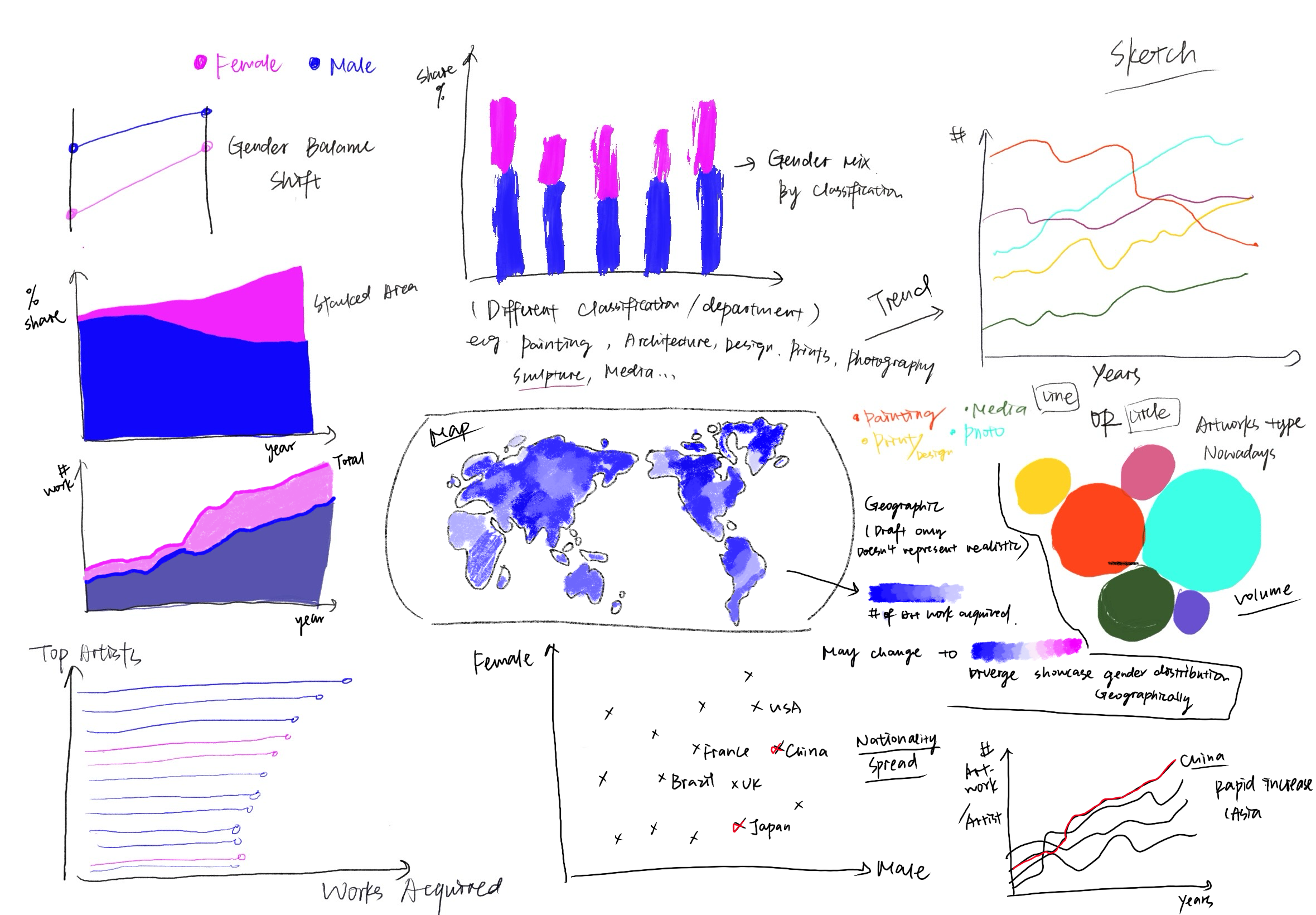
I also want to look at patterns across departments and mediums (painting, photography, design, etc.) and explore whether the time it takes for an artwork to be acquired after it was created has changed. My goal is to keep the analysis accessible—focusing on clear visuals that help people quickly see the patterns and understand the bigger story about representation and recognition in art.
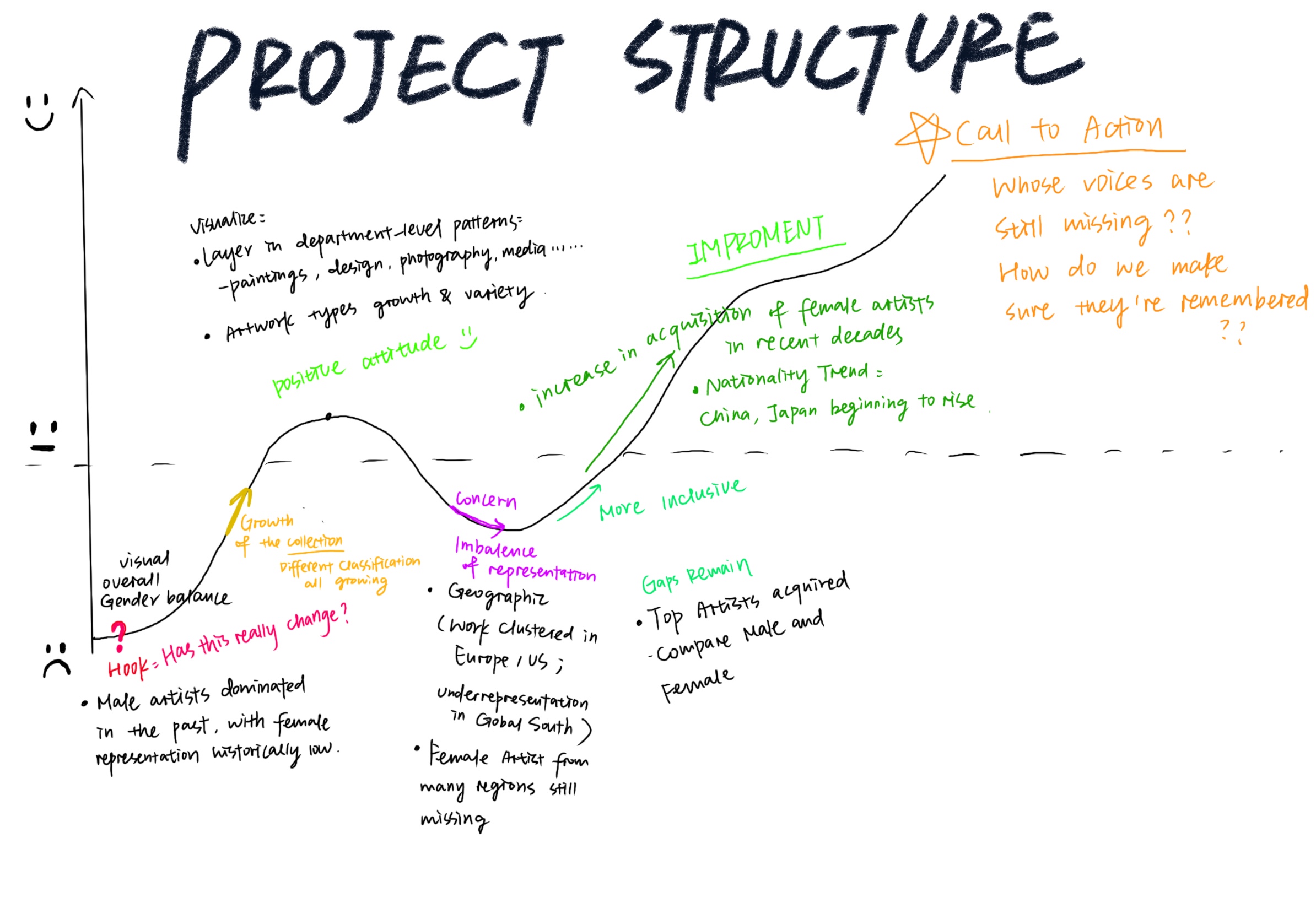
Project Structure (Story Arc)
 One Sentence summary:
Museums don’t just collect art, they shape whose voices and perspectives are remembered, and the data shows how representation and recognition have shifted over time.
User Stories:
As a casual museum visitor, I want to quickly see if museums are more inclusive now than they used to be.
As a student of art history, I want to connect museum acquisitions with larger cultural shifts.
As someone curious about representation, I want to know if female and international artists are being recognized more often.
As the project author, I want to practice turning a big, messy dataset into a story that’s clear and easy for anyone to follow.
Initial sketches
The data
I use two public datasets from the MoMA Collection, available through Maven Analytics. The first is the Artworks table, which includes details like artwork title, date made, medium, department, and date acquired. The second is the Artists table, which records attributes such as artist name, gender, nationality, and life dates. These two tables can be linked through the Constituent ID field.
I plan to use these datasets together to tell a story about representation in MoMA’s collection. The Artworks table provides the timeline of acquisitions and the context of which departments and mediums works belong to. The Artists table allows me to analyze who is represented, with a focus on gender and nationality. Together, they make it possible to track changes in gender balance across decades, compare departments, and calculate how long it took for different works to be acquired. This combination allows me to show not only the growth of MoMA’s collection but also the ways inclusion and recognition have shifted over time.
| Name | URL | Description |
|---|---|---|
| Artworks | Artworks.csv (MoMA GitHub) | Information about each artwork in the collection, including Object ID, Title, Artist ID, Date Made, Medium, Department, and Date Acquired. |
| Artist | Artists.csv (MoMA GitHub) | Background details about each artist, such as Constituent ID, Name, Gender, Nationality, Birth Year, and Death Year. |
Link to data source: https://mavenanalytics.io/data-playground/the-museum-of-modern-art-(moma)-collection
Method and medium
I will use Tableau to create interactive charts and then embed them in Shorthand to build a scroll-based narrative. This combination allows me to present both the data analysis and the story flow in an engaging, interactive way.
References
Maven Analytics. The Museum of Modern Art (MoMA) Collection [Dataset]. Data Playground. Available at: https://mavenanalytics.io/data-playground/the-museum-of-modern-art-(moma)-collection
AI acknowledgements
I used AI mainly to get a bit of help with technical refinements, catching small grammar mistakes, and brainstorming extra sketch ideas.